Jan 21, 2011
 Bathroom
,
Bedroom,
Decorating,
Homestaging,
Interior Design,
Interior Designer,
Kitchen,
Living Room,
Occupied Staging,
Property Enhancements,
Real Estate,
Redesign,
Renovations,
Selling Strategies,
Vacant Staging,
home staging
Announcing: Pantone’s 2011 Colour of the Year!
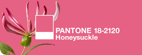
Pantone LLC, an X-Rite company (NASDAQ: XRIT), and the global authority on color and provider of professional color standards for the design industries has announced PANTONE® 18-2120 Honeysuckle, a vibrant, energetic hue, as the color of the year for 2011.

At ACCENTUATE Home Staging Design Group, we LOVE this colour…for interior design and home staging projects alike. It’s a true “statement colour” that is energizing and guaranteed to liven up any room of the house.
Go ahead, give it a whirl….try it in the entry, in your dining room, a bedroom or bath. Too dramatic for you?….use it to “ACCENTUATE” your rooms in smaller doses. Paint a key “accent wall” , add a few toss cushions, some terrific vases or a new piece of art “touched” with honeysuckle.
Tell us what you think! We’d love to hear your adventures into this dynamic new colour trend.
Read on for the full article from Pantone.
A Color for All Seasons
Courageous. Confident. Vital. A brave new color, for a brave new world. Let the bold spirit of Honeysuckle infuse you, lift you and carry you through the year. It’s a color for every day – with nothing “everyday” about it.
While the 2010 color of the year, PANTONE 15-5519 Turquoise, served as an escape for many, Honeysuckle emboldens us to face everyday troubles with verve and vigor. A dynamic reddish pink, Honeysuckle is encouraging and uplifting. It elevates our psyche beyond escape, instilling the confidence, courage and spirit to meet the exhaustive challenges that have become part of everyday life.
“In times of stress, we need something to lift our spirits. Honeysuckle is a captivating, stimulating color that gets the adrenaline going – perfect to ward off the blues,” explains Leatrice Eiseman, executive director of the Pantone Color Institute®. “Honeysuckle derives its positive qualities from a powerful bond to its mother color red, the most physical, viscerally alive hue in the spectrum.”
Eiseman continues, “The intensity of this festive reddish pink allures and engages. In fact, this color, not the sweet fragrance of the flower blossoms for which it was named, is what attracts hummingbirds to nectar. Honeysuckle may also bring a wave of nostalgia for its associated delicious scent reminiscent of the carefree days of spring and summer.”
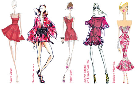
Honeysuckle is guaranteed to produce a healthy glow when worn by both men and women. It’s a striking, eye-catching hue that works well for day and night in women’s apparel, accessories and cosmetics, and in men’s ties, shirts and sportswear. Add a lively flair to interior spaces with Honeysuckle patterned pillows, bedspreads, small appliances and tabletop accessories. Looking for an inexpensive way to perk up your home? Paint a wall in Honeysuckle for a dynamic burst of energy in the family room, kitchen or hallway.
Honeysuckle products are currently available from a variety of manufacturers:
Wedding Apparel
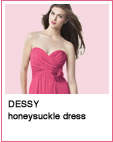
A flattering hue for wedding attendant apparel and accessories, Honeysuckle is now one of the nearly 200 PANTONE WEDDING Colors available from Dessy, a leading manufacturer of bridesmaid, social-occasion and flower-girl dresses. PANTONE WEDDING exclusively from Dessy provides a collection of color tools to make it easy for brides to achieve perfectly color-coordinated weddings – from inspiration to “I do.” See www.dessy.com for more information.
Paint
Honeysuckle is one of 3,000 colors available in Pantone’s line of superior-quality, eco-friendly paint. PANTONE Paints combine the accuracy of PANTONE Colors with the beauty of high-performance Dutch paints. See www.pantonepaints.com for more information.
Visa Card
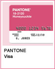
Whether you’re buying groceries, paying the dry cleaner or shopping for a pair of new pumps, now you can do it in style with a PANTONE Visa® Platinum Rewards Card in Honeysuckle, the 2011 color of the year. See www.pantone.com/visacard for more information.
Download the PANTONE 18-2120 Honeysuckle press release here.

   
Fashion
Honeysuckle always works with the standard basics of black, navy, charcoal or light to mid gray. But using complementary bronze greens like Willow PANTONE 16-0632 and/or Tapenade PANTONE 18-0840 adds a new sophistication to the combination that showcases the energy of Honeysuckle. The green tones can be really interesting in accessories for Honeysuckle tights and top. Another great and unique combination is Honeysuckle with a pinkish brown like Apricot Brandy PANTONE 17-1540. Think of a warm cashmere turtleneck in Apricot Brandy with a matching skirt and shoes to blend and flatter the legs. A Honeysuckle cashmere scarf and belt create a luscious combination. And to blend all the colors, try a big and bold patterned bag with every color mentioned above.
Home Interiors
Honeysuckle is upbeat and dynamic when used on large areas like the entry area of a house or an apartment. It is an appetite and conversation stimulant when used on the dining room walls. In the kitchen, it adds a fun touch on the table in placemats and other linens (patterned or solid), colored glassware, candles and small appliances. Honeysuckle is a great color to cover up shabby kitchen cabinets, or, if that’s too much of a color statement for you, try repainting knobs and drawer pulls. But be warned – once you try this arresting shade, it can become addictive.
Packaging
Honeysuckle is an excellent packaging color for products that speak to something active or festive, or are suggestive of sweet tastes and scents. It’s an especially good shade for delicious food or drink packaging. The name Honeysuckle is evocative of these perceptions. The closest match to Honeysuckle PANTONE 18-2120 TPX in the PANTONE PLUS SERIES is 205 U, p. 45 (choose uncoated – coated is much more vibrant). One of the best combinations for Honeysuckle in the PLUS SERIES in the context of deliciousness is a grape shade 2573, p.76. Grape should be used in lesser amounts than Honeysuckle with the smallest component in a rich chocolate shade like 483, p.32.
PANTONE Color of the Year 2011 can be found in the following PANTONE Color Systems:
| fashion + home: |
|
18-2120 TCX or 18-2120 TPX |
| |
|
|
| fashion + home CMYK: |
|
|
| |
|
|
| PLUS SERIES: |
|
205 U (closest match) |
| |
|
|
| PLUS SERIES CMYK: |
|
|
| |
|
|
| RGB: |
|
|
| |
|
|
| Goe™ System: |
|
26-2-4 |
| |
|
|
| Plastics: |
|
Q190-3-1 |
|
